

Good Game Background
A customizable After Effects background with randomizable hexes and icons and eight swappable colors, all driven by two sliders.
Hi! I’m Andy. I’ve spent nearly two decades in motion graphics and art direction, and somewhere along the way, I became just as interested in building the tools as using them (so these days, I do both). My reel’s over on the right, and there’s more of my work and code just below.





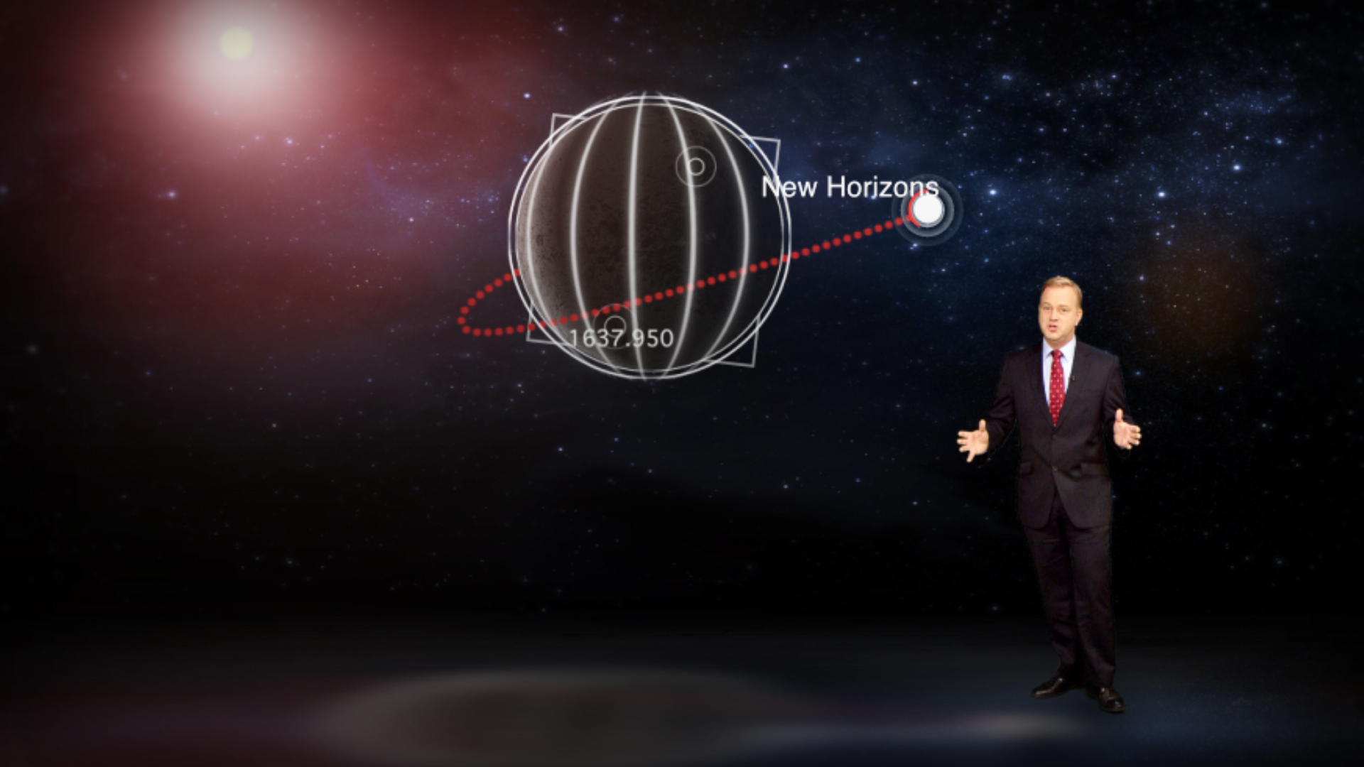




























A selection of my motion design and direction work. Hover a frame to preview, click to play the full piece.

















A customizable After Effects background with randomizable hexes and icons and eight swappable colors, all driven by two sliders.
How to create a single After Effects mogrt that adapts a graphic to multiple resolutions (16×9, 9×16, 1×1) using a master switch in a master composition.

Technical design details for a modular motion-graphics package with looping hero art, master comps, color sliders, and auto-resizing lower thirds.
How naming conventions, automatic resizing, and standardized assets speed up production for weekly advertising.

FX AutoDesigner automates strict After Effects branding workflows, cutting promo production time from hours to minutes.
Best practices for MOGRT construction using a master null, configurable transitions, and a streamlined Essential Graphics UI.
A few of the After Effects scripts and pipeline tools I’ve built to make production a bit quicker and easier.
Sorts and color-labels a messy project panel into a clean folder structure, in one click.
A dockable panel for storing color swatches and applying them to layers, text, and shapes.
Builds multi-ring and single-ring graphs connected directly to animated numbers.
Works with up to 20 data points across 4 lines. Fully animates and builds itself automatically with no external data needed.
Builds pie graphs with up to 10 slices without an external data hookup. Labels percentages and builds a key if requested.
Builds bar graphs with up to 12 individual bars and animates them automatically. Works horizontally and vertically.
Turns a selected comp into a framed, client-ready WIP version.
ae-guide-makerShrinks a layer into a locked reference thumbnail, hidden from renders.
ae-same-above-as-belowMatches a layer’s in and out points to the one above or below it.
ae-read-speed-calculatorEstimates read-aloud time for a script and builds a timed comp.
ae-alphabitizerStacks a long list of text layers into alphabetical order.
ae-fast-slideshowBuilds a Ken Burns-style image slideshow comp from scratch.
ae-mogrt-riggerWires text layers and null-driven controls into Essential Graphics automatically.
ae-screenshot-generatorSaves a PNG of each selected comp every N frames.
ae-adaptive-resolution-templateA starting-point AE project for building adaptive-resolution templates.

Motion designer who writes way too many lines of code.
Hello, I’m Andy, a creative technologist and designer with close to two decades of experience making colorful things move. My career started in broadcast graphics and art direction, and somewhere along the way I discovered that I was just as interested in building the tools as I was in using them. So, while I was a senior designer at FX Australia and National Geographic Channel, I quietly automated my own job. I took the networks’ branding guidelines, resources, and templates and programmed them into an After Effects pipeline that would automatically make promos and graphics for me each week.
It worked exceedingly well (too well, in fact; I had to start taking on new projects just to keep busy). That project set the direction for everything since, and I’ve been combining design and code to make productions and pipelines faster and easier.
These days I keep a two-day-a-week Creative Technologist role at the University of Sydney, and spend the rest of my time on an international freelance practice, taking on motion graphic projects with studios and agencies, building branding assets and TV graphic packages with MOGRT/Essential Graphics templates, writing ExtendScript automations, and helping teams figure out how to enhance their production flows. I care a great deal about design and direction, but I care just as much about efficiency.
If you’re looking for someone who can do both (and talk sensibly about how they connect), I’d love to hear what you’re working on.
After Effects smart templates for a national retailer that include features such as text-driven content, automatic re-sizing and spacing and swappable assets standards to meet tight approval cycles.
A 12-course MBA graphics kit developed for a compressed schedule. Auto-resizing lower thirds, slider-driven key art, adjustable transitions. Deployed across a five-editor team.
Excel-to-After-Effects system generating nearly 100 schedule-driven, production-coded lower thirds a month. Cut a three-day manual build to roughly two hours.
ExtendScript system that coded the network’s branding guidelines into an automated promo builder. Cut average 30-second promo turnaround from four hours to fifteen minutes.
A customizable After Effects background with randomizable hexes and icons, and eight swappable colors, all driven by two sliders, so the client never has to open After Effects.
This was a fun one. A broadcast client came to me wanting a background with a video game look. Something bright and fun, but with enough restraint that it wouldn’t fight with whatever they laid on top. The catch was they wanted it to look a little different every single time they used it, available in a handful of colors, and simple enough that they wouldn’t have to go into After Effects to change it.
When the brief came through, they wanted a background they could use on social and broadcast: a fun, video game look, but not so busy that it distracted from whatever went on top. They had a couple of requirements:
Relatively straightforward. So I went about doing some initial designs, and you can see the evolution we landed on below.



We got the design settled in its entirety before I began any of the scripting and UI, which tends to be the way to do it and save yourself some headaches. Most new folks, when they start a project they know is going to involve MOGRT work, try to set that side up first, or in parallel with the design phase. I’m here to tell you: no. Please don’t do that. I’m begging y’all to stop doing that.
The number of times I open a project where they’ve already got a huge list of properties in the Essential Graphics panel and the client hasn’t even seen a design is astronomical. It is very, very easy to add properties after you’ve finished the animation and design. Get your look finished and approved first, then go into rigging up the nuts and bolts. Speaking of which…
Now that the look was signed off, I started mapping out the guts of this thing. Going back to the brief and the design, I came up with the variables I’d have to deal with:
Keeping the client’s “keep it simple” requirement in mind, I tied everything to two slider controls: one to randomize the hex and icon (so each iteration looks different), and another for color. The client didn’t care about the individual icons as long as they varied.
I didn’t want a system where they had to adjust every single icon and hex by hand. Sometimes with MOGRTs people feel like the more properties the better; let the editor control everything. Sometimes that’s necessary. Most of the time it isn’t. You don’t want the editor groaning every time they pull your asset into their timeline because they’ve got 50 sliders to set.
I decided early that I wanted one comp to hold all the icons and one to hold all the hex styles. Each icon is cut to exactly one frame, then run down the timeline, so icon 1 starts at frame 0, icon 2 at frame 1, icon 3 at frame 2, and so on.

I put that comp into the master background comp and created a “Master Null.” On most of my MOGRT projects I make a master null at the top of the timeline to hold the controls and hook everything up to it. It’s one layer holding all the properties I’ll eventually bring into Essential Graphics, so I don’t have to hunt through layers.

I froze the icon comp and wrote an expression so that every time the Design slider changed, it would pick a random frame. Take the slider value, use random() to generate a number, and multiply by .04 (one frame is .04 of a second at 25fps) to land on a single frame:
var input = thisComp.layer("MASTER NULL").effect("Design")("Slider");
var totalIconSize = comp("ICON").numLayers;
seedRandom(input, true);
Math.floor(random(0, totalIconSize))*.04; // @ 25fps


The hexes were a bit different, since they had a subtle looping motion, so lining them all up down a timeline wouldn’t work. Instead I set up a hex precomp holding all the different hexes and switched between them, using the same idea to randomly pick a number and turn the right layer on or off:
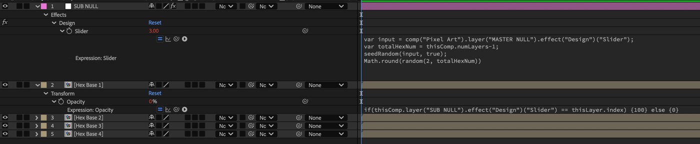
if(thisComp.layer("SUB NULL").effect("Design")("Slider") == thisLayer.index) {100} else {0}I needed a separate “sub null” to generate the random number rather than hooking each layer up directly. Otherwise, each layer would generate its own number, and you’d sometimes get two layers on, or none. Doing it this way guarantees one number that every layer reads.



Now that I have one working, I want to break this out to multiple hexes with multiple icons. Because we’re using random properly, every time this slider moves, every icon and every hex is going to be different. I just quickly set one up as an example. The difference between these two screens was all caused just by shifting one slider by one:


From there, it was just breaking out to the different colors and altering the scale and position of these hexes and we got the design in different colors:






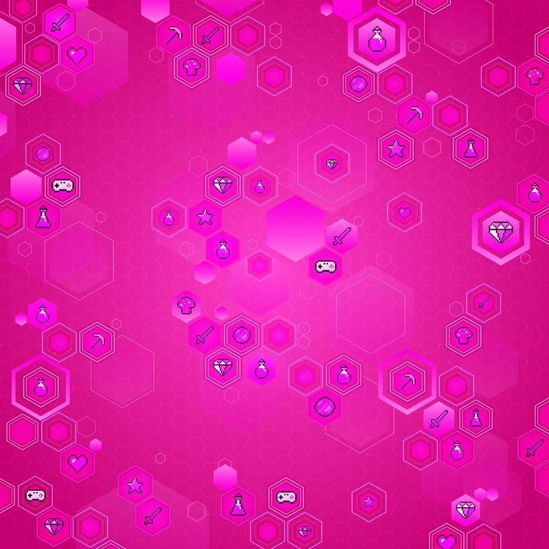

I might break this out and talk more about how I did the color breakdown and tied that in but I think that’s enough for now. Feel free to reach out if you have any questions or want to know more. Happy to explain anything in more depth. Cheers!
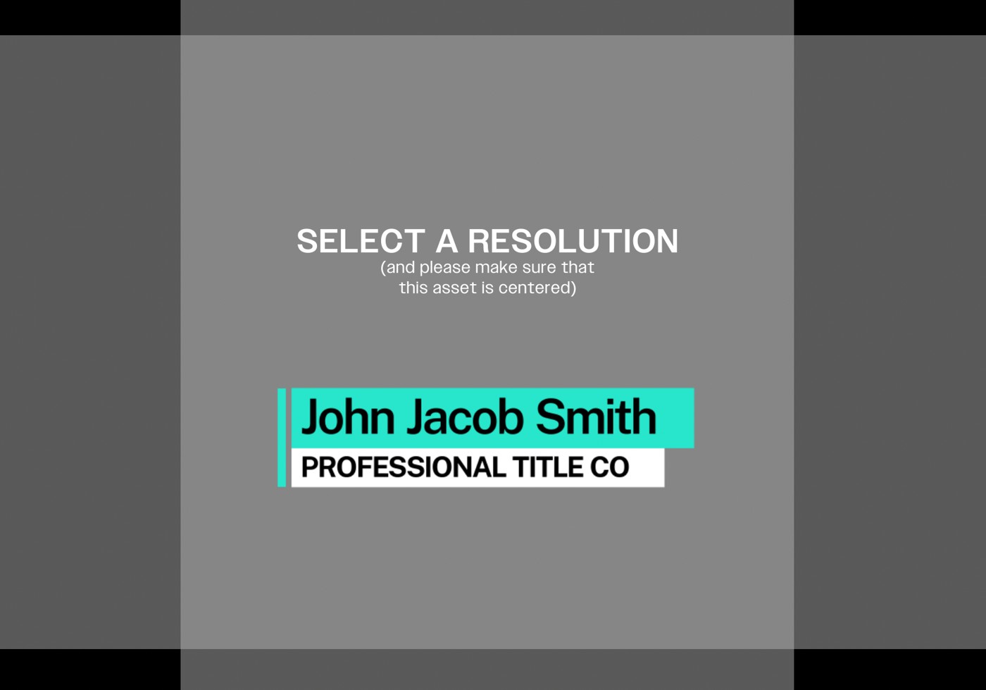
How to create a single After Effects mogrt that adapts a graphic to multiple resolutions (16×9, 9×16, 1×1) using a master switch in a master composition.
Years and years ago, it was maybe a bit easier on resolution. You really had 2 formats you designed for; 4x3 and 16x9. And that was about it. You were either doing graphics for a show in one or the other. Times were simpler (well, in this department. Ask anyone from then about doing a frame pulldown and their eye might start twitching).
But now, thanks to social media, we’re dealing with all sorts of different frame sizes. What an exciting time to be alive.
Let me take you through how I solve this issue when I have a client who’s going to output to various different platforms. It’s pretty standard now a days for a campaign to run with similar visuals on broadcast, social and digital so we’d like a single asset that can adapt to all of them. I have a lower third for a small business below that I made that needed to be used in exactly that way.

So, first things first, get the design approved. As with almost all automation things, when dealing with clients, make sure they approved the look, feel and timing of the piece before going through the process of adapting it to various resolutions. You don’t want to make more work for yourself and having a client come back down the track asking you to “speed it up” or “make the logo bigger” or “make the name smaller” (jk, no client has ever asked for their name to be smaller).
From there we then adapt the design to work in all the possible resolutions we’re going to need. For this example, let me just use the three most common ones: 16x9, 9x16, and 1x1.
I just did two adaptions at the start, a horizontal one and a vertical one because with some resolutions, you can just move one of these two into the right place and that’ll work. You’ll see as we go on.
But, now that I have these two I need to set up a master comp that’ll end up being the actual mogrt we export.
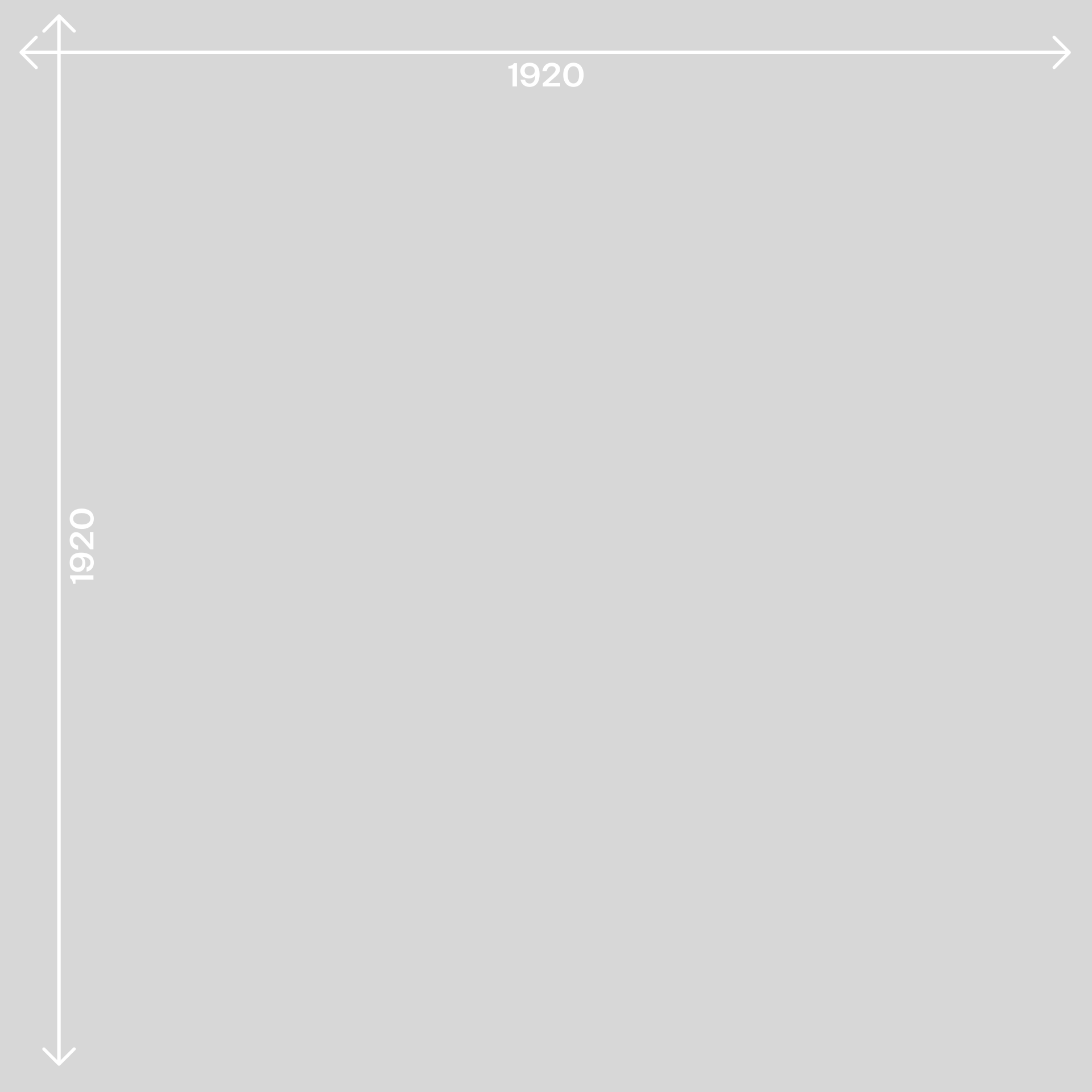
So, I’ve got my main adaptions and now I’m going to make a comp that’s the max horizontal size and max vertical size of all the adaptions we’re putting together. In this case the biggest horizontal size is 1920 and the biggest vertical is also 1920. So I’m going to make a comp that’s 1920x1920.
Now, I’m going to drag my two comps into this larger comp and make sure they’re centered. I’m also going to set up a master null for this comp cause I’m going to want a control somewhere that I can rig up so we can easily switch between the resolutions. I always like putting global controls on a master null (even if it’s just a single property).
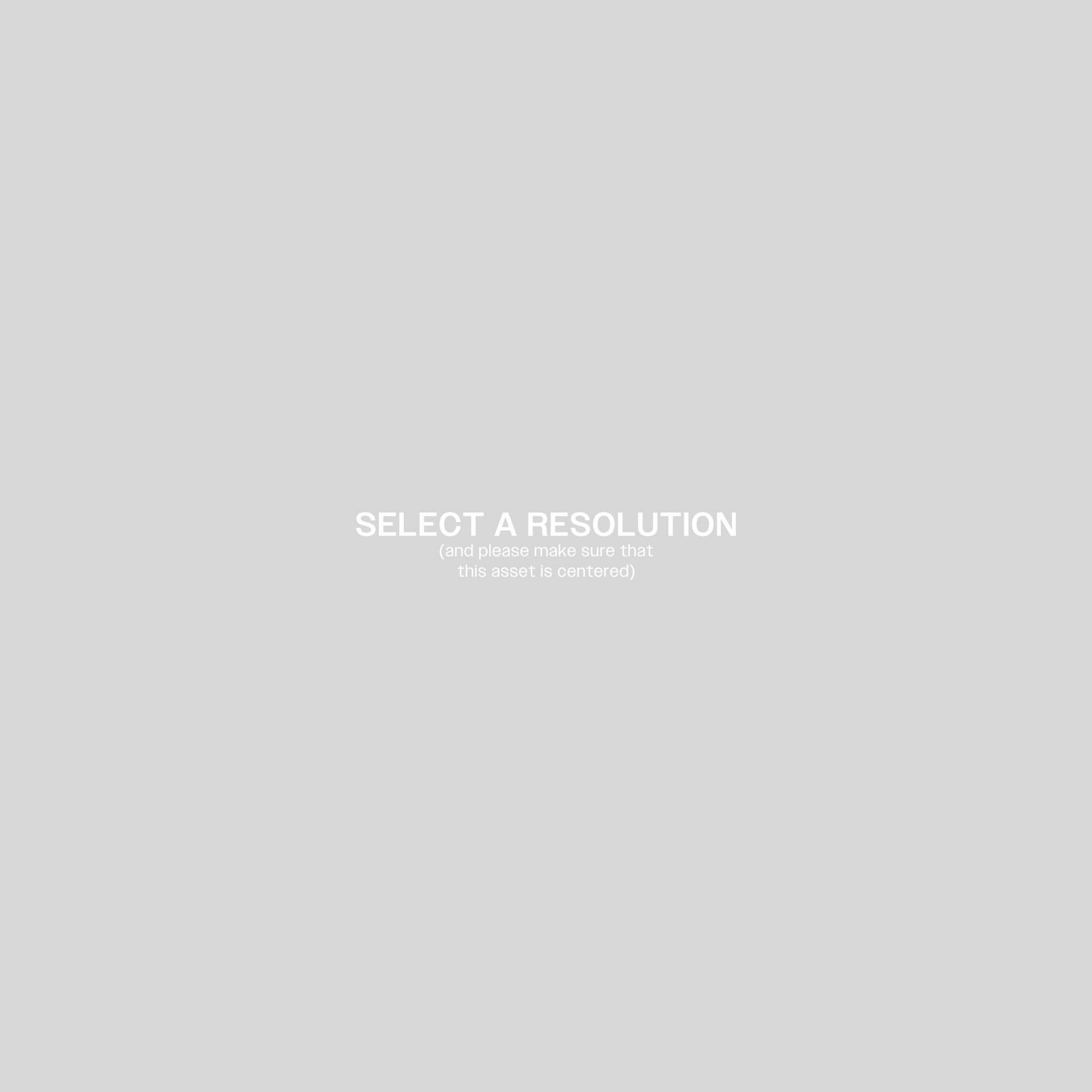
So, I’ve got my two comps in there, my master null, and now I’m also going to put a piece of text in the center stating 2 things, what this comp is and asking the user to set a property. Because we are using a big square comp, when we set a poster time, the thumbnail is going to look weird so I use this piece of text as a landing and instruction page.
Now that I have my elements, I just need to rig them all to a drop down expression control that will show each resolution when selected.
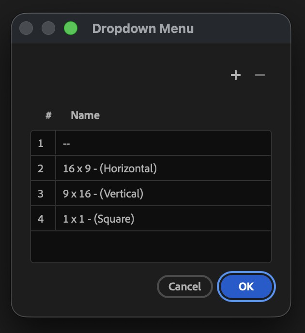
A dropdown expression controller is a fun little bit of tech. Basically clicking on the edit button in the corner lets you edit the options with your own text which is assigned to a specific and exact number. You can see here I put all our resolutions in place.
For something like this, you could use a slider control and you’ll see in this project, I use slider controls for color options but when deciding which control to use, I run a test in my head. I pretend there’s a producer behind me and they’re overseeing the production of this asset. If it’s a property that a producer is going to think about and want to quickly see varying options for, like color, I hook it up to a slider. If it’s something exact, I hook it up to a dropdown. The reason I do that, is the usability inside the essential graphics panel. A slider is something I can slide and easily shuffle through options and a producer is going to want to quickly go back and forth between option 2 and 3 and then option 3 and 1 and then option 3 and 4 (and then for some reason 2 and 3 again) while they’ll almost certainly not want to swap between resolution options.
As for the expressions, It’s easy. I’m just hooking up the opacity of each layer to a number in the dropdown menu. If it’s 1, show the text (which I’ll also make sure is our default state); 2 is our 16x9 comp and 3 or 4 is our vertical comp.

I also make sure that for our 1x1 comp, we move the 9x16 comp up to the right spot by using this expression in the Y position.

if(thisComp.layer("MASTER NULL").effect("RESOLUTION CONTROL")("Menu") == 4) {678} else {960}Now, when the editor picks a resolution, it’ll only show the lower third in the right place for that resolution.
As for the rest of the properties, we have a few options but the easiest way I’ve found, and the one that is least likely to break is to set one of these comps’ properties to the essential graphics panel in this master comp and then have all the rest, read and replicate that comp’s properties. So for example here, I have the 16x9 comp’s text and color controls added to this master comp’s essential graphics panel AND I have the 9x16 comp’s expression linked to the 16x9 comp’s.
Now, I have a staging screen and all 3 resolutions in the same mogrt. The editor can play with it from there. In an actual production workflow, it’s very common in Premiere for editors, once they have an edit locked and need to convert it to other resolutions, they’ll duplicate that sequence and then adjust the footage spatially. This sort of graphic also means, that instead of having to readjust graphics, the editor can just select the new resolution and the graphic will fit that resolution automatically, keeping intact the options and properties that have already been put in there.



Technical design details for a modular motion-graphics package with looping hero art, master comps, color sliders, and auto-resizing lower thirds.
So this was a massive project and easily one of the biggest projects I’ve done before. I was on a team of producers, editors and designers who were tasked with doing the media production for 12 courses within an online MBA program at the University of Sydney. In my role, this meant developing a motion graphics package that could be distributed to editors as they assembled literally hundreds of videos. With a project this big, the key was developing a series of projects, templates and guidelines to keep things organised and efficient as we rolled out the package.
The central focus of this package was all around the Hero Art. For each of the 12 courses, each unit was going to have a piece of key art that related to each unit’s primary tenets and focus.




Each of these pieces of key art was designed by the team’s visual designer and then handed off to me for animation and integration. I decided early to animate them in an 8 second loop. When dealing with unknowns, control what you do know. And while I didn’t know exactly how each editor was going to use all the graphics, I knew that I didn’t want to restrict the timing of our editors. Different courses might require this sort of hero art to be on for 3 seconds or 30 seconds depending on pacing and content. By making the key art into a looping asset, we weren’t going to be restricted in future as the asset can now run as long or as short as you need it to.
For me, my brain likes using 8 seconds as a looping duration. 8 divides down nicely into 4, 2 and 1 meaning you can set up in the larger loop, smaller loops that run for 2 or 4 seconds and they’ll all reset at 8. You can see here in this piece, I have these rings on a 2 second loop, these checkerboards on a 4 second loop and this arrow on an 8 second loop.
But when put together, they all hit at 8 and form a seamless loop.
Knowing that key art was going to be used throughout the graphic package, I needed to structure these assets in a way that made it easy for the editors to switch between them. This meant placing the looping assets into a master key art comp.
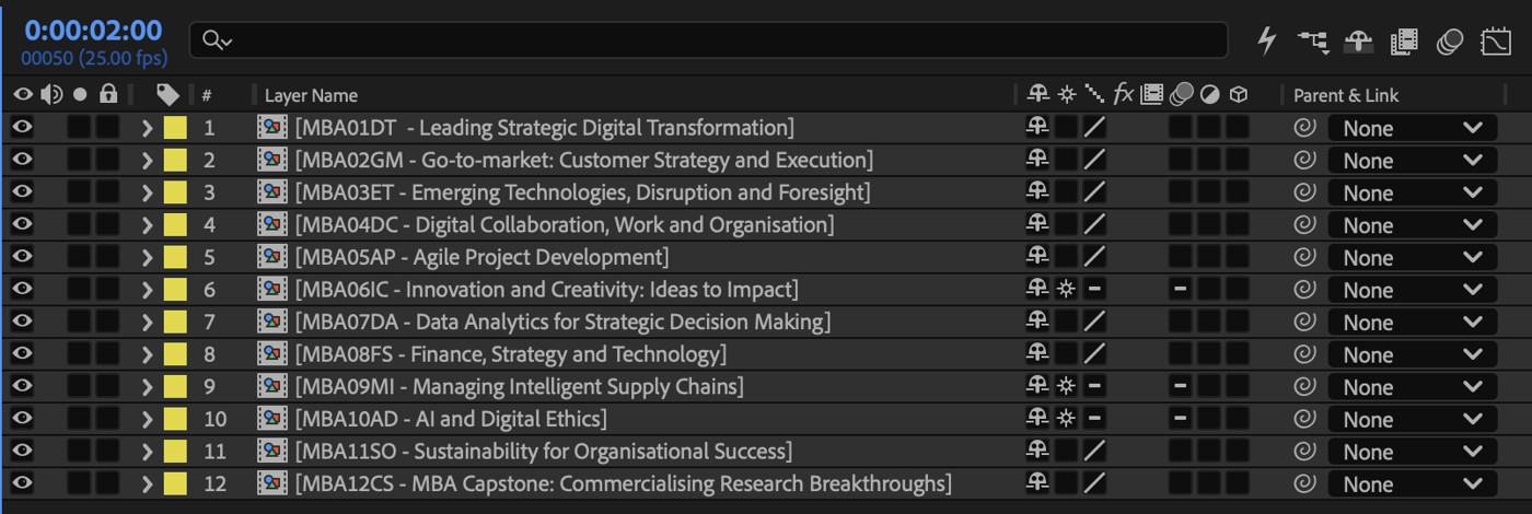
This master comp was then used throughout all the other standard graphic templates. If there was a section that required key art, in a frame, we would insert this master comp instead of the individual key art. From here, it was hooked up to a slider control and then the editor just had to enter the number of the course they were working on and the key art would update within that template correctly.


Similar things were done with the color controls. We standardized the colors pretty early in the process so instead of just putting those colors into each template individually, I made a master expression that swapped between those colors when necessary.
var numb1= Math.round(thisComp.layer("MASTER NULL").effect("Primary Color")("Slider").value);

if(numb1 >= 7 || numb1 <= 0){
		var detNum = String("Primary Color " + 1);
} else {
		var detNum = String("Primary Color " + numb1);
}

comp("Color Control").layer("MASTER COLOR NULL").effect(detNum).color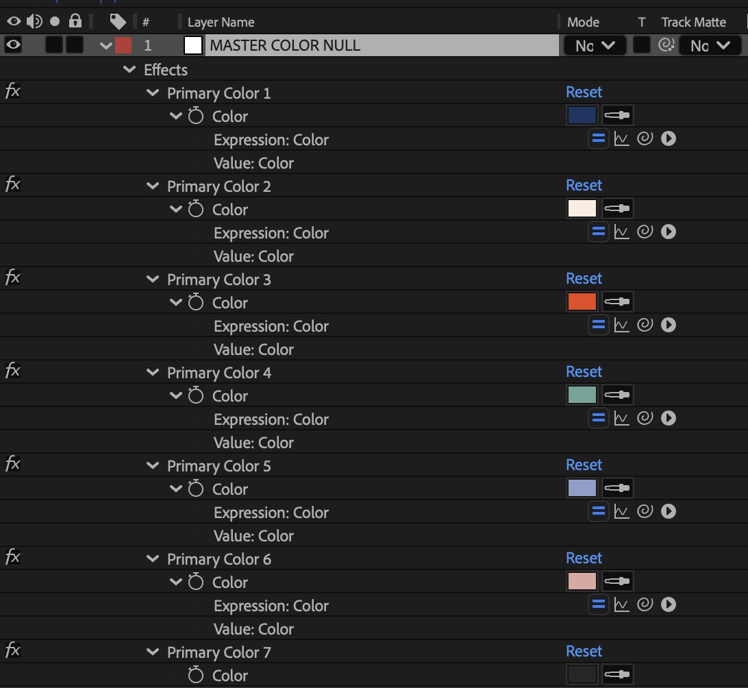
This expression/null combination meant that the colors were locked to a slider control and editors could swap easily between them. As you’ll see below, this lower third was designed to allow editors a variety of color choices within the brand guidelines.

Speaking of the lower third, it’s a good example of some other automatic design functions I built into the package. With the lower thirds, we wanted the design to show or hide information and resize itself automatically depending on what was needed. If there was a need for 3 lines of text, the lower third needed all three lines visible but if we only needed 2 lines, that third line should hide itself, the overall box of the lower third should resize but the animation should be unaffected.

The length of the lower third also resizes with the length of the text. This presented an issue though as we were never going to know what line of text was going to be the longest. Someone might have a long name and a short title and someone might have the exact opposite. So, the lower third itself had to figure out which line was the longest. This came down to writing an expression that was able to read all three lines of text, find the longest and use that as the determining factor for the overall size of the box:
var rCheck = thisComp.layer("MASTER NULL").effect("Right Check")("Checkbox");
if (rCheck == true) {
  [0, 540];
} else {
  var startLoc = 1920;
  var layer1 = Math.round(thisComp.layer(5).sourceRectAtTime().width);
  var layer2 = Math.round(thisComp.layer(6).sourceRectAtTime().width);
  var layer3 = Math.round(thisComp.layer(7).sourceRectAtTime().width);
  var largest = Math.max(layer1, layer2, layer3);
  var bufferAddition = Math.round(
    thisComp.layer("MASTER NULL").effect("Additional Space Control")("Slider")
  );
  if (layer3 >= layer2 - 15 && layer3 >= layer1 - 15) {
    var extraSpace = 30 + bufferAddition;
  } else {
    var extraSpace = 0 + bufferAddition;
  }
  var widthOfBox = largest + 184 + extraSpace;
  [1920 - widthOfBox, 540];
}
This takes away an ask from the editor. I’ve seen lower third designs in the past where either the editor was asked to resize the box manually with a slider or they would have to tell the template which line was the biggest but with some smart, well-crafted expressions, we can get the template to do the work for us. If you can make something happen automatically inside the comp, without involving human input, things move faster, easier and are less prone to errors.
How naming conventions, automatic resizing, and standardized assets speed up production for weekly advertising.
Sometimes, speed is a vital part of the design process. Sometimes you’re lucky and get a client with a massive budget for whom you can spend days on research and experimentation. But, just as likely, you’ll get clients where speed is an important part of the business.
I had a client that needed to turn out a set of ads every week. They were a national grocery chain whose sales changed week by week and each new week meant new sales and new sales meant a new spot. And this would go on for nearly every week of the year so they needed a template system that allowed them to not just produce quickly but produce consistently at scale.
So, over the years, I started building small bits of smart expressions and quality of life enhancements into their templates and systems to assist in making sure things got done fast.
One of the easiest areas to squeeze time out of was by making sure I wasn’t repeating tasks or entering the same information twice. I wanted a way to enter the price information once (in the name of the precomp) and then have that information flow to wherever I needed it in the actual design itself.
So when I change the precomp name, the price would update and that’s what happens here.
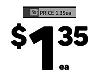
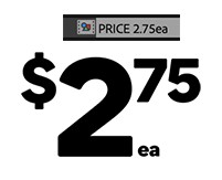
Several expressions located in the source text property of the text layers read that comp name, parse the data that’s appropriate for them and then change to what needs to be changed.
var compName = thisComp.name;

// Strip "PRICE " prefix
var raw = compName.substring(compName.indexOf(" ") + 1);

// Unit is always the last 2 characters
var unit = raw.substring(raw.length - 2);

// Check for a dot
var dotIndex = raw.indexOf(".");
var dollars;
var cents;
if (dotIndex !== -1) {
  dollars = raw.substring(0, dotIndex);
  cents = raw.substring(dotIndex + 1, dotIndex + 3);
} else {
  dollars = raw.substring(0, raw.length - 2);
  cents = "";
}

// --- Change this final line per layer ---
dollars; // Dollar Layer
// cents  // Cents Layer
// unit // Unit LayerI use the “.” to act as a break point between data. Any number before the . goes to the dollar place, the next two numbers go to the cents place, and the last two characters are placed into the unit section.
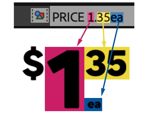
Going hand in hand with this was making the text resize and position itself correctly based on the type. A 1 in the dollar section is going to be shorter than 9 or 22 so I wanted the text to read their own dimensions and position themselves accordingly.
This was achieved by setting up a series of expressions in the x axis of each layer that read off the layer before them:
//Dollar Position
thisComp.layer("$").transform.xPosition+29+(thisLayer.sourceRectAtTime().width/2) + (thisComp.layer("MASTER NULL").effect("DOLLAR FINE TUNE")("Slider")*.1)

//Cents Position
thisComp.layer("DOLLARS").transform.position[0] + (thisComp.layer("DOLLARS").sourceRectAtTime().width/2) + (thisLayer.sourceRectAtTime().width/2) + 8 +(thisComp.layer("MASTER NULL").effect("CENTS FINE TUNE")("Slider")*.1);I start with the location of the $ and, moving from left to right, read the width of the dollar text and position the cents where they should be. The unit designator then reads the cents location and sits on its X but the dollars Y so everything is lined up and straight. When the cents place isn’t needed (so for example the price is just 5 dollars not 5.10) the cents text turns invisible but its location placement is still known and the unit designator still places correctly.
Then in the master comp, when I swap in the price precomp, the whole precomp reads the layer’s overall size and will scale it correctly.

It understands how long the total width of all the layers (and their spacing) is together and is able to determine an appropriate size to make it.
These price comps all live in the template along with dozens of other assets that relate to product or special or value or type and depending on what the client wants to highlight one week or another. To make it quick and easy to go between them, I standardised the assets. Assets always come in different sizes and types but, by making sure that all comps in the template were the same size across the various places they could be used, swapping out like assets means that they’re already scaled and positioned correctly.
Many designers feel like they need to make all their precomps either the size of output or size of asset. Please get out of that habit. You have the ability to make any precomp any size so find one that works for your template structure and design.
If you can just quickly change the product because all the product comps in the library are the same size, then it’s not a matter of resizing or readjusting every time, it’s just a matter of finding the asset and replacing it.
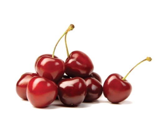

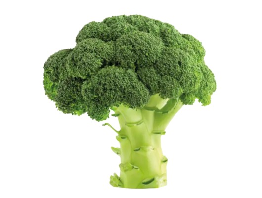
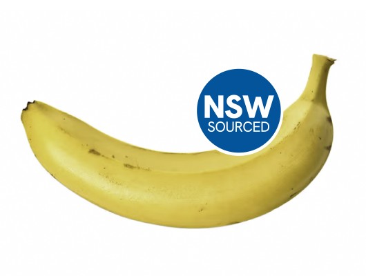
I also set up what I called “Rolling” comps. These were for things like tags or markers that were needed for some assets. For example, on the fruit and veg, occasionally they would want to put where those items were sourced from so I had a precomp with all those tags in the right place and a slider control hooked up to that precomp that the user would be able to control. From there, they would be able to just use the slider to find the right asset right in the comp instead of hunting through the library.
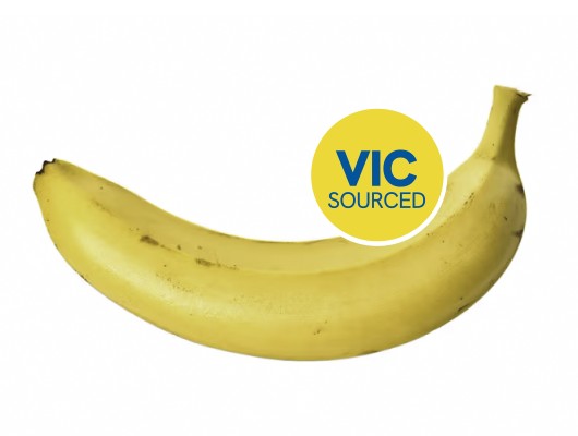
Organisation and automations mean that I was able to churn these sort of spots out and make changes quickly and efficiently without it disrupting my whole day.
This template was eventually paired with a couple other scripts I wrote like the WIP_maker and Broadcast_outputs scripts, which combined a bunch of tasks into a one-button experience. In the case of those two, the WIP_maker would instantly make and export WIPs for the clients in the right specs and the Broadcast_outputs would label and export the final approved spots in the right sizes and formats that were necessary for the various channels they would need to go to.
FX AutoDesigner automates strict After Effects branding workflows, cutting promo production time from hours to minutes.
My first big role was as a senior designer at National Geographic Channel and FX Australia and after about a year on this job, after working with the FX Brand day in and day out, it dawned on me that this brand was not only incredibly well designed, but it was also very exact in how that design needed to be followed. From here, it became a bit of a quest to try and see how much of this design I could convert into automation and hence an “AutoDesigner” was born.




The reason this was able to work was because FX has such strict branding requirements. Text always needed to be one of two fonts. Key messaging always had to appear in the center of the screen and text above the font needed to be left aligned and text below needed to be right aligned. There were only so many colors or textures that the background had to be and depending on the background, the text had to be a corresponding color. And so on and so on. After a while, these branding guidelines became second nature to me and while they were strict, this strictness lent itself to a system where software could interpret the design.
If key text always needs to be aligned in the middle of the screen, then the computer can find the exact center and put the text there. Why was I, the designer, doing something a piece of software could do faster?
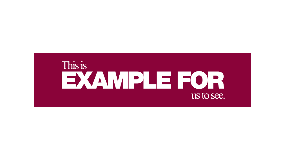
So, the first thing I did when I was planning to build this was to sit down and think about every single step I did from getting a promo cut from a producer to giving it back to the producer for review. What do I do first, second, third, etc? And I really needed to break this down. Even getting the cut into the program was more than just a simple one step. When broken down, it looked like this:
That’s eight steps before I even start the process, When designing a program, I need to look at every step, every single small thing, and then, look through those steps and see what can be done and what can’t be done.
Once I got all the steps down, I started looking at what I could do and what the computer could do. Nowadays, with AI, it’s probably easier to automate everything, but back when I was assembling this, I found a distinct place in the process where I, as a user, would have to intercede and offer my input. At the time, when we got promos from producers, we’d get a full cut of the spot with black sections for places where we’d put the supers, logos, endboards and any other graphics that were needed.
Because this was a video file, I, as a human, could read where the black sections I needed to work on were but the computer could not. The computer could tell where a cut was but not what the cut meant. As a result of this, I broke the AutoDesigner into two parts, Part 1 and Part 2.
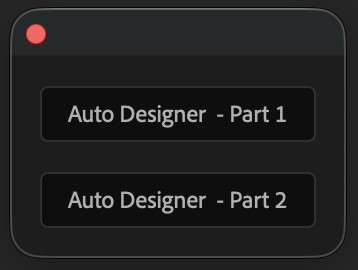
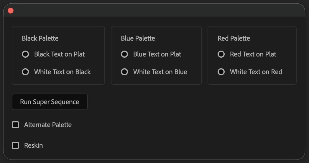
Part 1 ran at the start of the sequence and took me up to the point where I would need to go in and point out where a super or graphic was supposed to go. I would then go in and tell the system, “hey, this is where a super goes, this is where a logo goes, this is where the endboard goes,” and then I would run part 2. Part 2 would read my notes about where a super or graphic would go (which I would mark via an adjustment layer’s color) and then go in and for each graphic, ask me a series of questions depending on what graphic it was. For example, if it was a super, it would ask me what text gets put into the graphic:
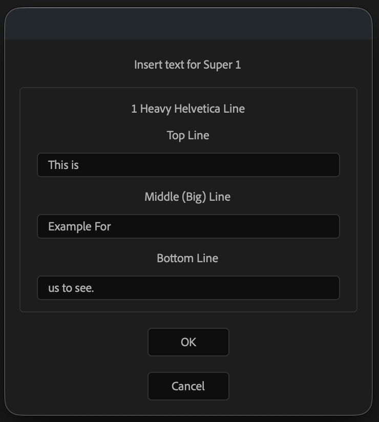
And then it would do all the other tasks necessary for me such as, making sure the text was aligned correctly and putting the right amount of chevron overlap on for each super.
So, once I got this built and running properly, I was able to cut down on my time within After Effects immensely. It used to take around 3-4 hours to do a 60 second promo. But with this software, who could do all those things faster than I ever could, without having to go into the timeline, I was able to get that time down to about 15 minutes. It freed up my time to work on other projects, to take on my intricate design work and to refine this system. I added improvements into place like the ability to reskin a promo so we could easily see it in different color combinations and let a producer decide on the right direction.
From there, I would update the AutoDesigner as the brand evolved and changed. When we added new colors and styles into the brand, I’d update the UI and the options.
The AutoDesigner didn’t replace me. It just got out of the way, so the time I used to spend on repetitive builds went straight back into the design work I actually wanted to be doing.
Best practices for MOGRT construction using a master null, configurable transitions, and a streamlined Essential Graphics UI.
Let’s talk about a standard process of building out a MOGRT because I haven’t done that in a while and there’s some new techniques that I’ve updated and this opening graphic is a pretty good example of a lot of those techniques. Here, I have this opening graphic I built that the client wanted some options for.
The brief was very straightforward. They wanted their logo animated in at the start and then transition through the little gem icon into a piece of footage. Sometimes that footage needed to have the glass panel transition wings on the side or the tag on the top or both and they wanted to be able to control the color. Pretty simple and easy so here’s how I did it.
Something I’ve been doing for ages, and I still think it’s a good idea, is using a Master Null for the properties I’ll be using in the essential graphics panel.
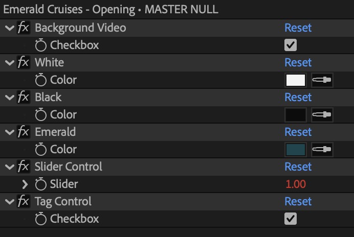
This is usually a bright pink (Fuchsia label) null that sits on the top of the timeline. It keeps things straight for me and enables me to keep things clean and organised so I don’t have to go looking around for properties later on when I go to add them to the UI panel. Organization saves time and sanity.
One of the things I have also started doing in these master nulls is holding brand colors directly in them. You’ll see here, I took the 3 main brand colors and have them stored here in this master Null.
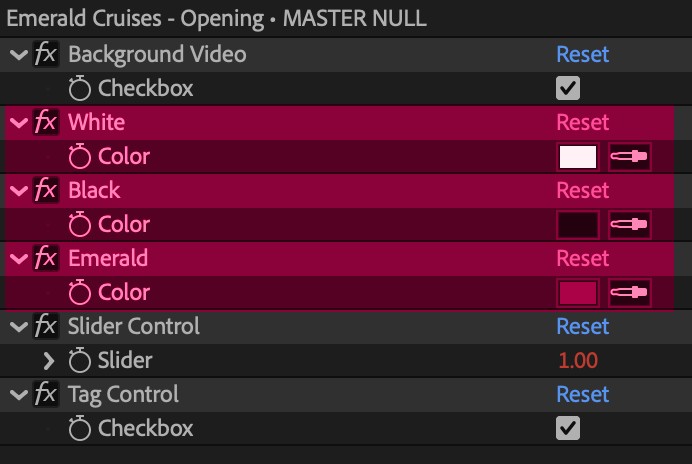
I do this now so I have the colors where I need them in an easy reference location, the color picker is notoriously unreliable, and (and this is my new favorite thing) because they are stored this way, they are accessible via expressions. Instead of having to program the colors in to every asset where color can be changed, I can write a master expression like this:
switch (
  thisComp.layer("MASTER NULL").effect("Slider Control")("Slider").value
) {
  case 1:
    thisComp.layer("MASTER NULL").effect("White")("Color");
    break;
  case 2:
    thisComp.layer("MASTER NULL").effect("Black")("Color");
    break;
  case 3:
    thisComp.layer("MASTER NULL").effect("Emerald")("Color");
    break;
  case 4:
    thisComp.layer("MASTER NULL").effect("White")("Color");
    break;
  default:
    thisComp.layer("MASTER NULL").effect("Emerald")("Color");
    break;
}And then just change the case numbers for the right combination. No more memorizing hex codes or, even worse, changing all colors at the end because a brand team has had “second thoughts on the exact shade of mustard” (that’s an exact quote that has been said to me.) This links all the colors back to a central location and that can be updated on the fly. This brand had 4 colors combinations to rig up so the user could quickly swap between them.




One other things I’d like to make a note of here is the use of a Math.round() expression in this null for slider controls.

This is a quality of life improvement I apply to all slider controls so they will return round numbers. Sometimes, in the Essential Graphics panel, the slider control will come to rest at like 3.4 but because I write my expressions to catch whole numbers with the switch, that won’t trigger it so I’ll go back to the default. Using the Math.round() on the slider itself makes sure that the slider always returns a correct number.
The client wanted the transitions out to have a few options:
So, that’s what I needed to plan out and honestly, not too hard. This became a layer order question. That tag was needed on both major options so I put that at the top of the stacking order. Then I knew that those glass panels were going to be done via adjustment layers so I was going to have to put those layers above the footage layer.
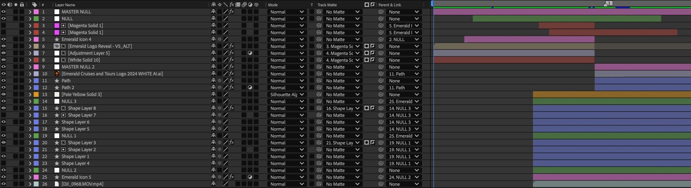
And for the transparent, that’s actually super easy to do. I just hooked up a solid layer with a silhouette alpha blending mode whose transparency was controlled by a checkbox control.
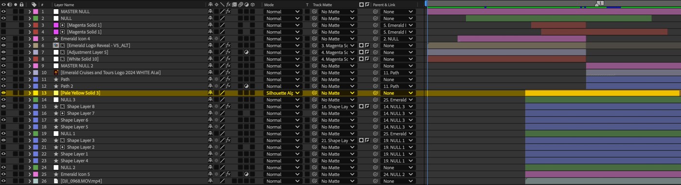
When that box was checked, the layer was visible and everything under it would be invisible. I placed that layer between where the tag was and where the glass panels and footage was.
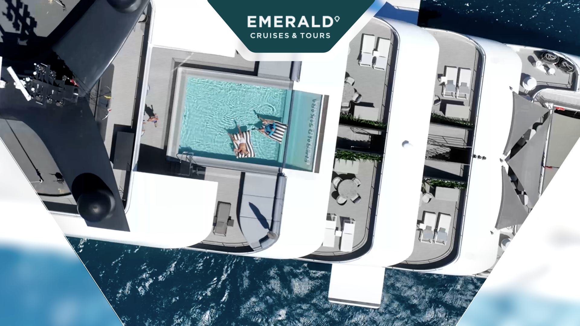

Now that I’ve got the asset working, when I go to rig it up in the Essential Graphics Panel, I follow a few rules with regard to the layout. I always try to place myself in the seat of an editor who’s going to be using this graphic. I want to enable that person (who will almost certainly not be a Motion Designer) to have enough control over the graphic but also have the UI simple enough so that they are not overwhelmed by the amount of options. You’ll see with this one:
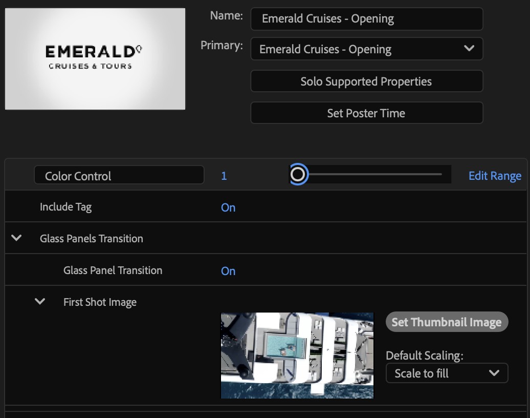
I don’t have color options as a color picker or separate options for each element. I have the whole color scheme hardcoded into a slider control. The brand has locked down the colors so there’s only so many options and those options are already decided for us so I just hooked this up to a slider and now that one control affects all the color options in this piece. Take away redundant controls if you can.
Next, I have the option to show or hide the tag. It’s just a simple checkbox control but I make sure to label it clearly. I don’t just have “Tag.” I have “Include Tag” so the editor knows exactly what this does. Be clear with your descriptions.
And below that I have a group that I’ve added for the controls of the glass panels. Sometimes I use groups for like properties (like if there’s a brand with freer use of color, I’ll put all the color properties in a group) or, like in this case, I’ll use groups to put options for an element into a section. This group is for whether the glass panel transition is active or not and what that footage is. Both those options are under the group.
Mostly with these sort of graphics, keeping things neat, organised and easy to use is how to get your editors to actually use them (and not hate you in the process).